Aesthetic text symbols and dividers that show on every phone
6 min read · 7 sections
Aesthetic text symbols and dividers look the same on every phone only when you pick them from the parts of Unicode that nearly every system font covers. The rest of the symbol world is full of characters that turn into empty boxes for half your audience, so choose before you paste.
I build bios, captions and nicknames from a small kit of symbols that I trust, and test anything new on a real phone first. This guide gives you that kit, the code points, the traps and ready-made divider recipes. To style the words themselves, use the font generator; for limits and layout see the Instagram bio guide.
Why a symbol shows as a box
A symbol is a character, and the phone draws it with a font. If the primary font has no glyph, the system looks through fallback fonts; if none has it, you get a box. Blocks that have existed in system fonts for a long time are the safest; rare scripts and recently added characters fail first. Competitor generators say the same in their notes: LingoJam points out that sites without a font containing the glyph show boxes. It is a coverage matter, not a bug in the generator.
Safe sets by Unicode block
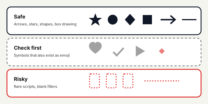
- Arrows (U+2190 to U+21FF): the simple arrows are everywhere. Use
→and↓style arrows, and avoid the heavy dingbat arrows in the next block when you can. - Miscellaneous Symbols (U+2600 to U+26FF): the outline and filled stars, hearts as card suits and musical notes are widely drawn.
- Geometric Shapes (U+25A0 to U+25FF): circles, squares, diamonds and triangles. They make clean bullets.
- Box Drawing (U+2500 to U+257F): lines for dividers. Designed to join in monospace; in proportional fonts they can differ in width, so keep runs short.
- Dingbats (U+2700 to U+27BF): florets and sparkles are mostly fine, but several entries also exist as emoji.
The code points below were read with Python's unicodedata, so names and numbers are exact. The verdict is my judgement from how widely each block is drawn.
| Symbol | Code point | Name | Block | Verdict | Good for |
|---|---|---|---|---|---|
| → | U+2192 | rightwards arrow | Arrows | Safe | Pointer to your link |
| ↓ | U+2193 | downwards arrow | Arrows | Safe | Points down to a link line |
| ⇒ | U+21D2 | rightwards double arrow | Arrows | Safe | Heavier pointer |
| ★ | U+2605 | black star | Miscellaneous Symbols | Safe | Rating, bullet, divider |
| ☆ | U+2606 | white star | Miscellaneous Symbols | Safe | Outline twin of the star |
| ♡ | U+2661 | white heart suit | Miscellaneous Symbols | Safe | Light heart without emoji form |
| ♪ | U+266A | eighth note | Miscellaneous Symbols | Safe | Music accents |
| ● | U+25CF | black circle | Geometric Shapes | Safe | Bullet |
| ◆ | U+25C6 | black diamond | Geometric Shapes | Safe | Divider element |
| ◇ | U+25C7 | white diamond | Geometric Shapes | Safe | Outline twin of the diamond |
| ▲ | U+25B2 | black up-pointing triangle | Geometric Shapes | Safe | Marker |
| ─ | U+2500 | box drawings light horizontal | Box Drawing | Safe, short runs | Divider line |
| ═ | U+2550 | box drawings double horizontal | Box Drawing | Safe, short runs | Double divider line |
| ┈ | U+2508 | box drawings light quadruple dash horizontal | Box Drawing | Safe, short runs | Dotted divider line |
| ✦ | U+2726 | black four pointed star | Dingbats | Mostly safe | Four-point sparkle |
| ✿ | U+273F | black florette | Dingbats | Mostly safe | Flower |
| ⋆ | U+22C6 | star operator | Mathematical Operators | Mostly safe | Small star between words |
| · | U+00B7 | middle dot | Latin-1 Supplement | Safe | Spaced separator |
| • | U+2022 | bullet | General Punctuation | Safe | Round bullet |
| ❤ | U+2764 | heavy black heart | Dingbats | Check | Has an emoji form |
| ✔ | U+2714 | heavy check mark | Dingbats | Check | Has an emoji form |
| ▶ | U+25B6 | black right-pointing triangle | Geometric Shapes | Check | Has an emoji form |
| ✨ | U+2728 | sparkles | Dingbats | Check | Shows as colour emoji |
| (invisible) | U+2800 | braille pattern blank | Braille Patterns | Risky | Blank spacer, may be stripped |
| (invisible) | U+3164 | hangul filler | Hangul Compatibility Jamo | Risky | Blank filler, may be stripped |
| (invisible) | U+200B | zero width space | General Punctuation | Risky | Invisible, often removed |
The emoji-form trap
Some old symbols have a second life as emoji. A heavy black heart, a check mark or a play triangle may be drawn as a flat monochrome symbol on one phone and as a coloured emoji on another, which changes size, colour and sometimes the width of the line. A variation selector can force a choice: U+FE0E asks for the text form and U+FE0F for the emoji form, and both are one extra invisible character in your count. If the exact look matters, take a symbol without an emoji form, such as a white heart suit or a star outline.
What I leave out
- Rare scripts used as decoration (syllabics, Bamum, Tibetan marks, Sinhala letters). They look pretty on the phone that has the font and empty on others.
- Invisible spacers such as the blank Braille pattern, the Hangul filler or the zero-width space. Platforms often strip or alter them, and they confuse screen readers.
- Glitch and combining stacks. They may overlap neighbouring lines, so I keep them out of multi-line fields.
- Look-alike letters from other alphabets mixed into words. They can break search, usernames and spam filters.
How to test before you publish
- Paste the symbols into the real field (bio, nickname, caption), not just a notes app, because the app may filter or substitute.
- Check a second phone from another maker or an older system version. Boxes appear there first.
- Switch light and dark mode. Outline symbols can look thinner against a dark background.
- Look at it as a visitor after saving, in the profile view and in a search result if the platform shows one.
- Read it aloud as plain text. If a screen reader would announce a long string of names, shorten the decoration.
Divider recipes
A divider separates ideas in a bio or caption. Keep it short so it never wraps on a narrow screen; mine stay under about 15 characters. The columns show visible characters and UTF-16 units (all of these are one unit each). The generator's bio builder has a symbol palette and eight ready dividers that insert at the cursor, and it crosses out any symbol your device has no font for.
| Recipe | Result | Visible | UTF-16 | Use |
|---|---|---|---|---|
| Thin rule | ──────── | 8 | 8 | Plain section break; box drawing |
| Double rule | ════════ | 8 | 8 | Heavier break between blocks |
| Dotted rule | ┈┈┈┈┈┈┈┈ | 8 | 8 | Light break that stays quiet |
| Star rule | ⋆ · ⋆ · ⋆ | 9 | 9 | Soft, works between two lines of text |
| Diamond rule | ◇ ◆ ◇ | 5 | 5 | Neat three-piece divider |
| Sparkle sandwich | ✦ ─── ✦ | 7 | 7 | Rule framed by sparkles |
| Dot trail | • • • | 5 | 5 | Calm and compact |
| Arrow pointer | ↓ ↓ ↓ | 5 | 5 | Leads the eye to a link |
Spaces in the middle of a divider matter: they let a line wrap cleanly and keep the symbols from merging. A divider that is one long unbroken run of box drawing characters can look broken if the fallback font has different widths.
Using symbols with styled text
Symbols carry no styling problem, so they pair well with a single bold line: a star, a short rule, then the plain description. That keeps the styled characters few and the count low, and the two counters in the bio builder show the effect at once. If you also post on Discord, the Discord guide shows where markdown replaces Unicode decoration altogether.
Questions and answers
Which symbols are safest to copy and paste?
Arrows, stars, hearts as card suits, circles, squares, diamonds and box drawing lines come from long-established Unicode blocks that most phone fonts cover.
Why does a heart or check mark look different on my friend's phone?
Several old symbols also exist as emoji, so one phone draws the plain symbol and another draws a coloured emoji. Choose symbols without an emoji form if you need identical looks.
Can I use invisible characters for spacing?
I would not. Blank Braille, Hangul filler and zero-width characters are often stripped by platforms and can confuse screen readers. Use a visible divider instead.
How long should a divider be?
Short enough to stay on one line on a narrow phone, usually under about 15 characters. Use spaces between symbols so the line can wrap cleanly.
How do I test a symbol before using it?
Paste it into the real field, save, then view the profile on a second phone in light and dark mode. If you see a box anywhere, replace it.