Fonts for your Instagram bio: what fits and what breaks
7 min read · 7 sections
Fonts for your Instagram bio are not fonts at all: they are other Unicode characters that happen to look styled, and that single fact decides what fits, what breaks and what hurts. Here is how I use them so a bio stays inside the limit, stays readable on a small screen and stays findable.
If you only want the result, paste your text into the font generator, pick a style and watch the counters. If you want to know why some styles are safe and others quietly cost you characters or readers, read on.
The 150 limit and what it counts
Instagram's help center describes the bio as a short text of up to 150 characters (Instagram Help: add a bio to your profile). In practice spaces, emoji and line breaks all use up part of that budget, so a bio with four lines has already spent three characters on the breaks before you type a word.
The trap is the unit. A normal letter is one character everywhere. A styled letter such as bold sans-serif comes from the Mathematical Alphanumeric Symbols block, which sits outside the basic plane, so in UTF-16 (the unit JavaScript and many counters use) it takes two units. I cannot see which unit Instagram's counter uses internally, so I plan for the stricter one. If it counts the way JavaScript does, 150 is closer to 75 styled letters.
| Text | Visible characters | UTF-16 units |
|---|---|---|
| Hand-built ceramics (plain) | 19 | 19 |
| 𝗛𝗮𝗻𝗱-𝗯𝘂𝗶𝗹𝘁 𝗰𝗲𝗿𝗮𝗺𝗶𝗰𝘀 (bold) | 19 | 36 |
| 𝗠𝗼𝘀𝘀 & 𝗞𝗶𝗹𝗻 (bold) | 11 | 19 |
Combining decorations behave the same way in a different direction: a strikethrough or underline mark is an extra character after every letter, so a 12-letter word styled that way still looks like 12 characters but measures 24 UTF-16 units. Emoji take two units or more, and a heart with its variation selector can take more still. The takeaway: style a short line, then read the counter. The generator shows both the visible and the UTF-16 length in the bio builder (set to Instagram bio, 150) and on every style card, where a card over the limit is tagged "Over 150", so you can budget against the stricter number.
Why some letters turn into boxes
Styled text only displays if the viewer's phone has a font containing those characters. Most current phones carry bold, italic and monospace math letters; fewer cover every script or fraktur variant, and rarely used small capitals are the first to fail. A missing glyph shows as an empty box, often called tofu. Generators such as igfonts.io admit that Instagram filters out some fancy letters and symbols, so a style that works on your screen can still fail for someone else. Assume nothing: preview on a phone, in light and dark mode. The generator tests the characters against your own device's fonts and tags a style "May show as boxes here" when they fail; a "Rare characters" tag marks letters, such as small capital Q, F and S, that exist but are missing from many fonts.
Which styles read well on a small screen
A bio is read at arm's length, in about the size of a caption. My rule is simple: if you cannot read it at a glance, it is decoration, not information.
| Style | Small-screen legibility | My verdict |
|---|---|---|
| Sans-serif bold | Excellent, strong weight, plain shapes | Best choice for a name or one headline line |
| Sans-serif italic, bold italic | Good | Fine for a single accent word |
| Serif bold, monospace | Good, a little wide | Works for a tagline when the tone fits |
| Script, double-struck | Thin strokes, slow to read | Keep to two or three words |
| Fraktur | Hard at caption size | Only as a logo-like word |
| Circled, squared, full-width | Wide, uses the line fast | Initials or a title, nothing longer |
| Small caps, superscript | Patchy, some letters stay plain | Avoid in a bio |
| Upside-down, strikethrough, glitch | Poor | Skip for anything people must understand |
One more detail: styles with letter-level gaps in Unicode, such as italic or script, need borrowed letters from another block (italic h is U+210E, not part of the italic run). A good generator does that for you (this one fills all 24 gaps, so italic "hello" comes out as ℎ𝑒𝑙𝑙𝑜); a poor one leaves a wrong letter in the middle of your name.
Line breaks and spacing
Line breaks are the cheapest layout tool in the bio, and each costs one character. Use one break between ideas rather than blank lines. Copy the styled lines from the generator with the breaks intact, then paste into the bio field in one go. Spacer tricks made from invisible characters are tempting, but Instagram may trim or alter them, and they can behave differently across devices. A visible short divider (see the symbols and dividers guide) is more reliable.
Accessibility and search trade-offs
Styled letters are different characters from plain ones. Unicode's own guidance treats the math letters as symbols for mathematics, not as a substitute for styling, as the Wikipedia overview of the block explains. Consequences for you:
- Screen readers may spell the letters out, read their long Unicode names or skip them. See this note on Unicode accessibility.
- Search looks for the letters people type. A search for plain letters has no reason to match your styled ones, so keep your username and the name field people will actually search in plain text.
- Copy and paste carries the styled characters along, so a link or email written that way will not work.
My compromise: style at most one short line, keep every handle, email and keyword in plain letters, and write the line so that it still makes sense when read aloud as plain text. The "Copy plain-text twin" button hands back the bio as plain letters for any field that must stay searchable.
A bio layout, step by step
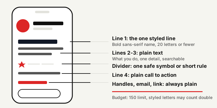
- Write the plain bio first. Name or brand, what you do, one proof or detail, one next step.
- Trim to about 120 visible characters. That leaves room for the one styled line to count double.
- Pick one line to style, usually the first. A bold sans-serif name is the safest.
- Paste the whole bio into the bio builder and check both counters, visible characters and UTF-16 units, against 150. To style only one word, select it and press "Style selected word".
- Add at most one or two symbols as bullets or arrows, taken from the safe sets.
- Preview it in the Instagram-style phone frame, in light and dark mode, then check a second device if you can. The frame is a generic mock-up, so the real app may wrap lines a little differently.
- Save, then reopen the profile as a visitor. If anything shows as a box, drop to a plainer style.
Three layouts, counted
These are invented examples. Counts include spaces and line breaks.
| Layout | Bio | Visible | UTF-16 |
|---|---|---|---|
| Small shop, bold first line | 𝗠𝗼𝘀𝘀 & 𝗞𝗶𝗹𝗻 Hand-built ceramics Small batches, shipped Fridays ↓ Next drop in the link | 86 | 94 |
| Photographer, symbols only | Travel photographer ✦ slow trips ✦ film + digital Prints & bookings: email in the link | 86 | 86 |
| Streamer, schedule line | 𝗟𝗶𝘃𝗲 𝗠𝗼𝗻 · 𝗪𝗲𝗱 · 𝗦𝗮𝘁 Cozy platformers & co-op nights Discord below ↓ | 68 | 81 |
The photographer's bio is the one I would recommend if you are unsure: symbols give structure at one unit each, and nothing important depends on a font. The other two stay under 150 on either count, but the margin shrinks quickly once you add a second styled line.
Using Discord as well? Read Discord text formatting: markdown vs fancy Unicode fonts, where the limit is 32 characters instead of 150.
Questions and answers
What is the Instagram bio character limit?
Instagram's help center gives 150 characters. Spaces, emoji and line breaks use part of that budget, and styled letters may count as more than one unit, so check the counter before saving.
Why do some fancy letters show as boxes?
The viewer's phone has no font containing those characters, so it draws an empty box. Bold and italic sans-serif are the safest; rare small capitals and fraktur fail first.
Can I use fancy fonts in my Instagram username?
Treat usernames as plain text. Styled letters are different characters from the letters people search for, so keep the handle plain and style only a short line in the bio.
Do fancy fonts hurt accessibility?
They can. Screen readers may spell the letters out, announce long Unicode names or skip them. Style one short line and keep names, links and keywords in plain text.
How do I add line breaks to a bio?
Type them in the bio editor, or copy a multi-line text from the generator with the breaks intact. Each break uses one character of the budget.